Adelaide heat mapping website now live
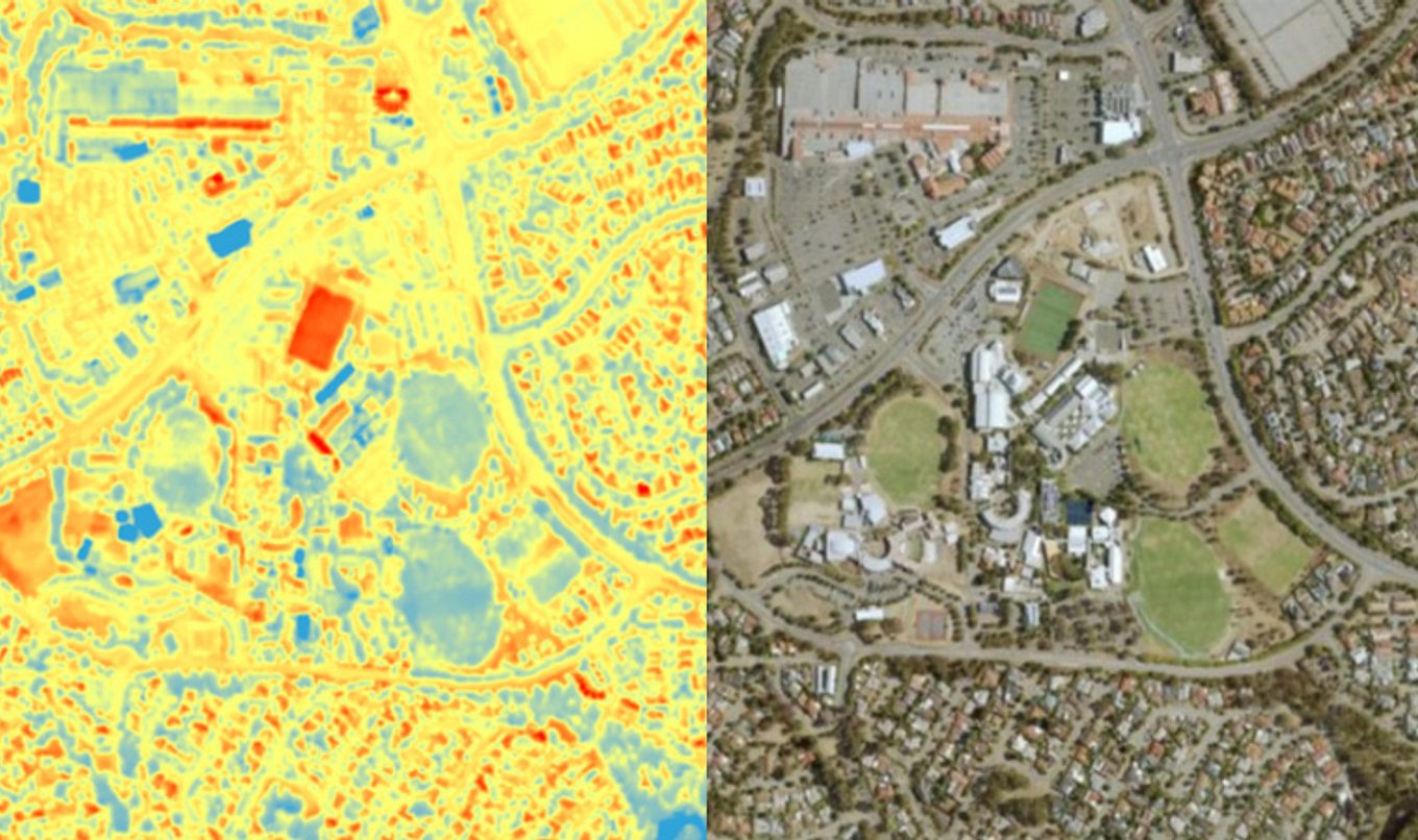
A new heat mapping tool is now publicly available to see how surface temperatures change across metropolitan SA.

The tool - Urban Heat Mapping Viewer website - forms part of an initiative to unify metropolitan Adelaide’s heat mapping data to help adapt to climate change.
Department for Environment and Water Group Executive Director of Science Sandy Carruthers said the new tool covers around 95 per cent of metropolitan Adelaide.
“With the use of daytime and nighttime thermal datasets, the mapping tool clearly shows the difference in temperature with the use of dark and lights colours - deep red for areas of extreme heat and blue for cooler areas,” Ms Carruthers said.
“Anyone can visit the website and drill down to their address to see how their home compares with their neighbours, or other parts of the city.
“It is interesting to see the contrast in temperatures between areas with lots of plants, irrigation and lawn, versus areas with minimal plants, non-irrigated parklands and artificial turf.
“Generally areas along Adelaide’s coast and those in established suburbs with lots of street trees, are cooler.
“Whereas areas of bitumen, such as roads and carparks, and artificial turf surfaces tend to be much hotter.”
Ms Carruthers said the heat mapping tool will support decision making to help mitigate climate change impacts.
Councils and the SA Government will use this information resource to target more tree planting and designing infrastructure such as roads and playgrounds to minimise urban heat, and counter the impact of rising temperatures caused by climate change.
The mapping was developed by councils and Seed Consulting and made available through the Department for Environment and Water’s website, EnviroData.

